
The "You've got mail" excitement from Sleepless in Seattle feels like a different era. Today, inboxes are crowded and subscribers are selective. Every business email has an intent and a desired outcome. Careful messaging gets you part of the way there. Design gets you the rest.
Email design can make or break a campaign. Taking the time to build visually strong emails is what separates the ones that get read from the ones that get deleted. That is why design deserves a proper seat at your email strategy table, not an afterthought once the copy is done.
"Together we are stronger" applies beyond the Bokke at the World Cup in France. It also applies to partnering with a local email marketing agency that understands both the craft and the context.
Here at TouchBasePro, a Johannesburg-based email marketing platform, our team has been helping clients for 19 years to build bespoke email campaigns designed to deliver real return on investment.
Here are the key visual design principles that make an email work harder:

#1 Layout: Organise content effectively
A well-considered layout is the foundation of any strong email template. Two elements deserve your attention here:
- Grid systems: Which one suits your content? Options include the rule of thirds, golden section, single column, multi-column, modular baseline, and responsive grid. Grids arrange information consistently, keep elements aligned, and produce a balanced result.
- Visual hierarchy: Place your most important content first. Eye-tracking research points to three layout formulas, the inverted triangle, the Z-pattern, and the F-pattern, each of which arranges text, visuals, and CTAs in a specific order. Pick one and stick with it. Mixing two pattern strategies in one email creates confusion.
Contact us to talk through your email layout options.
#2 White space: Give your content room to breathe
Plenty of white space (also called negative space) stops your email from feeling cluttered. It keeps the reader focused on what matters.
- Margins and padding: Use these to separate content blocks and prevent a crowded layout.
- Line spacing: Adequate spacing between lines makes body text easier to scan and read.
#3 Typography: Choose fonts carefully
Fonts are easy to overlook in an email strategy, but they carry real weight. Every email is a digital envoy for your brand, and the typeface you choose shapes how readers feel about what they are reading.

- Font choice: Pick legible fonts that match your brand tone. Stick to web-safe fonts so your email renders consistently across different email clients.
- Font size: Use larger sizes for headings and smaller sizes for body text. Both desktop and mobile readers should be able to read without squinting.
- Font colour: Keep contrast high between text and background. This improves readability for everyone, including subscribers with visual impairments.
#4 Images: Use high-quality visuals
According to the Visual Teaching Alliance, 90% of information transmitted to the brain is visual. Visuals are processed 60,000 times faster than text, and 40% of nerve fibres are linked to the retina. Your subscribers process images before they process a single word.
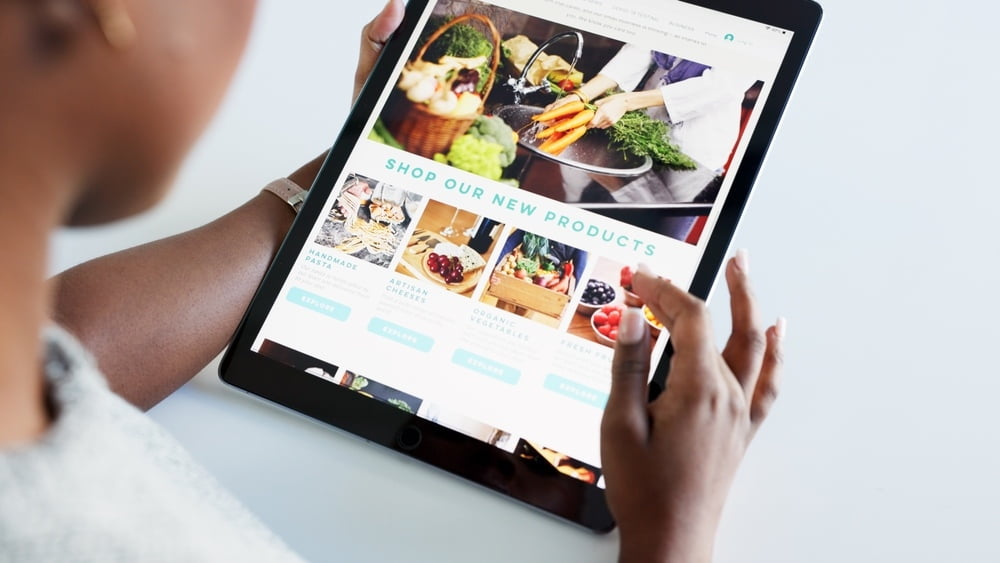
Images are powerful, but only when used well.
- High resolution: Blurry or pixelated images undermine trust and brand perception. Always use sharp, high-quality files.
- Alt text: Write descriptive alt text for every image. It supports visually impaired subscribers and loads as a fallback when images are blocked.
- Image size: Compress images to reduce load times without sacrificing quality. Slow-loading emails lose readers fast.
#5 Devices: Optimise for mobile
80% of people have mobile internet access and 80% of web traffic comes from mobile. A large slice of your audience is opening emails on a phone. If your email breaks on mobile, you lose them.

- Responsive design: Build templates that adapt to different screen sizes. Poor mobile layout signals to your audience that the experience was not designed with them in mind.
- Thumb-friendly CTAs: Place call-to-action buttons where a thumb can reach them comfortably, typically near the top or centre of the email.
#6 CTAs: Make them impossible to miss
Your CTA is the whole point of the email. Treat it that way.
- Use contrasting colours so your CTA button stands out clearly from the surrounding design.
- Write concise CTA copy. Be specific about the one action you want the reader to take.
- Use buttons, not text links. Buttons are visible and clickable. Text links get lost.
#7 Colour theory: Reinforce your brand and direct attention
Colour influences emotion and recognition. Use it with intention.
- Colour consistency: Work within your brand palette. Consistent colours build familiarity across every touchpoint.
- Colour psychology: Blue signals trust. Red creates urgency. Green is calming. Orange is energetic. Knowing these associations helps you choose colours that support your message rather than contradict it.
#8 Accessibility: Design for everyone
"Digital accessibility is the ability for a website, mobile app or software to be used by somebody who may have a disability that affects their hearing, vision, motor functions, or cognition. Digitally accessible design also applies to people who may have language barriers."

You can segment your audience carefully and still know very little about the individuals inside it. Accessibility fills that gap. People with disabilities rely on digital services as much as anyone else, and your email design should reflect that.
- Alt text: Screen readers use alt text to describe images to visually impaired subscribers. Write it for every image, every time.
- Fonts: Sans-serif fonts such as Arial are easier to read for subscribers with dyslexia, as the letterforms appear less crowded.
- High contrast: Strong contrast between text and background helps readers with low vision or colour blindness.
(Accessibility came into sharp focus at South Africa's World Cup Rugby game against Scotland, when the Springboks swapped their green and gold for mint-green to meet World Rugby's colour-blind policy.)
#9 Partnership: Work with TouchBasePro
Getting the visual design right is one piece of a broader email strategy.
With the TouchBasePro team behind your campaigns and access to our full platform, you can build beautiful emails that engage subscribers intelligently, drive higher returns, and tap into hyper-targeted content and advertising tools.
Let us help you strengthen your direct communications and sharpen your email strategy.
Frequently asked questions
- What grid system should I use for my email layout?
- It depends on your content type. A single-column grid works well for newsletters and plain announcements. Multi-column grids suit product catalogues or content with distinct sections. Responsive grids are essential if a large portion of your audience opens on mobile. The main rule is to pick one and apply it consistently so your email feels structured, not scattered.
- Which fonts are safest to use in business emails?
- Stick to web-safe fonts such as Arial, Georgia, Trebuchet MS, and Verdana. These render consistently across email clients including Outlook, Gmail, and Apple Mail. If your brand font is not web-safe, specify a fallback font in your CSS so the email still looks intentional if the primary font fails to load.
- How do I make my emails accessible to subscribers with disabilities?
- Three basics cover most of it: write descriptive alt text for every image, use high contrast between text and background colours, and choose sans-serif fonts for body text. If you send to a large or varied audience, also test your emails with a screen reader to check how the content flows for visually impaired subscribers.
- Why does mobile optimisation matter so much for email design?
- 80% of web traffic comes from mobile devices, and a significant share of emails are opened on phones first. If your template does not adapt to a smaller screen, text becomes unreadable, images break, and CTA buttons are too small to tap. Responsive design ensures the email looks deliberate and professional regardless of the device.