1. Primary Typeface: Roboto
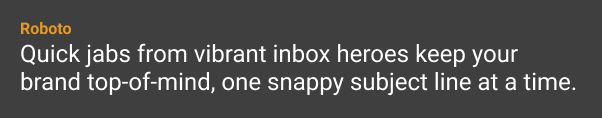
Roboto is clean, neutral, and highly legible across screen sizes. It complements our bold visual language without distraction.
- Font Name: Roboto
- Styles: Regular, Medium, Bold, Italic
- Usage:
- Body copy
- Forms and inputs
- Interface labels
- Legal/footnote text
- Email content
- Body copy
2. Display Typeface: Roboto Slab
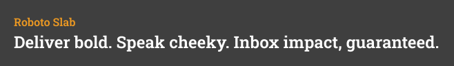
The slab serif adds warmth and personality — a cheeky wink that aligns with the brand’s voice. It works well alongside the logo and orange tones.
- Font Name: Roboto Slab
- Styles: Regular, Medium, Bold
- Usage:
- Marketing headlines
- Website hero blocks
- Presentation titles
- CTA banners and social graphics
- Marketing headlines
3. Web Compatibility
Roboto and Roboto Slab are Google Web Fonts, fully supported for use in digital applications:
- Load via Google Fonts CDN
- Compatible with all modern browsers
- Accessible fallback fonts: Arial, Helvetica, sans-serif
Embed Example:
html
<link href=”https://fonts.googleapis.com/css2?family=Roboto&family=Roboto+Slab:wght@400;700&display=swap” rel=”stylesheet”>
4. Typographic Hierarchy
| Style | Font | Weight | Size (Web) | Use Case |
| Heading 1 (H1) | Roboto Slab | Bold | 48px | Homepage hero, key titles |
| Heading 2 (H2) | Roboto Slab | Medium | 36px | Section titles, campaigns |
| Heading 3 (H3) | Roboto | Bold | 24px | Subheadings, CTAs |
| Body Copy | Roboto | Regular | 16px | Website text, emails |
| Caption / UI | Roboto | Medium | 12–14px | Labels, forms, nav |
5. Typographic Voice Tips
- Use Roboto Slab sparingly — headlines only. It shines when it’s not overused.
- Don’t mix too many weights on one screen.
- Always left-align text unless centering for headlines or symmetry.
- Keep line spacing generous for readability (1.4–1.6em recommended).