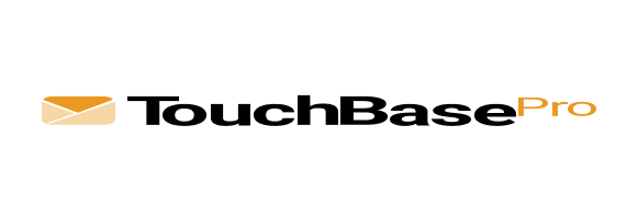
1. Primary Logo Lockup
![]()
- Icon: A stylised envelope with diagonal lines—suggestive of communication and forward momentum.
- Wordmark:
“TouchBase” in bold black (clarity, confidence)
“Pro” in #EB9822 orange (energy, attention-grabbing) - This lockup is used in most applications: digital headers, business docs, sales decks, and newsletters.
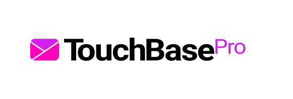
2. Alternate Logo Versions
Show and define usage for the following:
| Logo | Version | Use Case |
|---|---|---|
| Reversed (white) | On dark or coloured backgrounds | |
| Mono white | Over busy imagery or low-opacity photos | |
| Mono black | For grayscale documents or black-and-white print | |
| Icon-only | Social favicons, mobile UI, tight spaces |
3. Clear Space & Sizing
Minimum Clear Space
![]()
- Use the height of the envelope icon as the padding rule.
“Maintain a clear zone equal to the height of the icon on all sides.”
Minimum Size
- Print: ≥ 20mm wide
- Digital: ≥ 100px wide
- Below this size, use the icon-only version.
4. Incorrect Usage
| Example | Misuse Description |
|---|---|
 |
❌ Distort or stretch the logo |
 |
❌ Change brand colours outside of approved palette |
 |
❌ Add drop shadows or outlines |
| ❌ Reposition the icon and/or wordmark | |
 |
❌ Rotate or skew the logo |
 |
❌ Use unapproved backgrounds (e.g. too busy or low contrast) |
5. Background Colour Usage
Show the 3 approved contexts you’ve uploaded:
| Background | Logo Colour Treatment |
| White | Full-colour logo |
| Black | White logotype with coloured icon (or full-white) |
| Image/colour | All white (for contrast and legibility) |