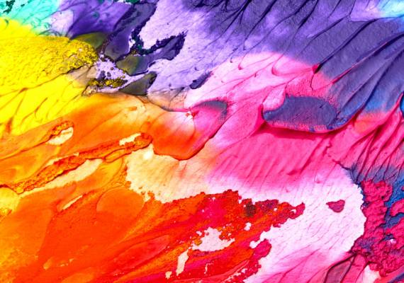
Mood & Style
- Tone: Bold, cheeky, upbeat, and irreverent — never boring.
- Vibe: Playful, personality-packed, and expressive. Think quirky facial expressions, dynamic poses, and unexpected props.
- Style:
- High contrast, bright tones, and minimal shadows
- Backgrounds in brand colours or vibrant complementary hues
- Diagonal overlays, geometric crops, and bold framing
- Slight retro references or nostalgic energy can work well
- High contrast, bright tones, and minimal shadows
Portraits & Product Shots
| Do | Don’t |
| Use expressive, diverse models with animated facial expressions | Use bland, corporate stock imagery |
| Remove backgrounds and layer over brand colour blocks or patterns | Leave subjects floating in white space or on dull backgrounds |
| Use dynamic crops and angles | Use straight-on, passport-style shots |
| Apply diagonal shapes and overlays in layouts | Stick to conventional layouts with horizontal/vertical divisions |
Framing & Composition Rules
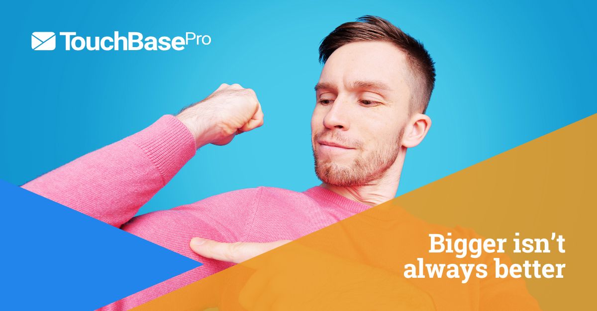
- Diagonal overlays (inspired by envelope icon): integrate diagonals in composition or post-layout treatments
- Text overlays: Sit in high-contrast boxes or shapes on the image—legibility is non-negotiable
Do’s and Don’ts Gallery
✅ DO:
- Use exaggerated expressions and playful props (giant goggles, megaphones, oversized glasses)
- Layer cutouts over coloured triangles/diagonals that match the brand
- Contrast subject emotion with bold messaging (“Create emails that rock!”)
- Mix real, diverse faces with clear brand tone
❌ DON’T:
- Use generic corporate imagery
- Go for washed-out colour grading or excessive filters
- Overcrowd the image with too much text
- Rely on humour that may not translate (avoid memes, offensive jokes)