Mobile devices are changing every aspect of our lives, from business (Uber anyone?) to government (they can spy on you now) and even our relationships (no phones allowed at the dinner table!). Unfortunately (or maybe fortunately) for online marketers, email marketing is no exception. The rise of mobile devices means that we need to embrace the Mobile First Era to improve the results we get out of our campaigns.
Below are 7 steps that you can take now to optimize your email campaigns for the Mobile First Era.
1. Use Mobile ready templates
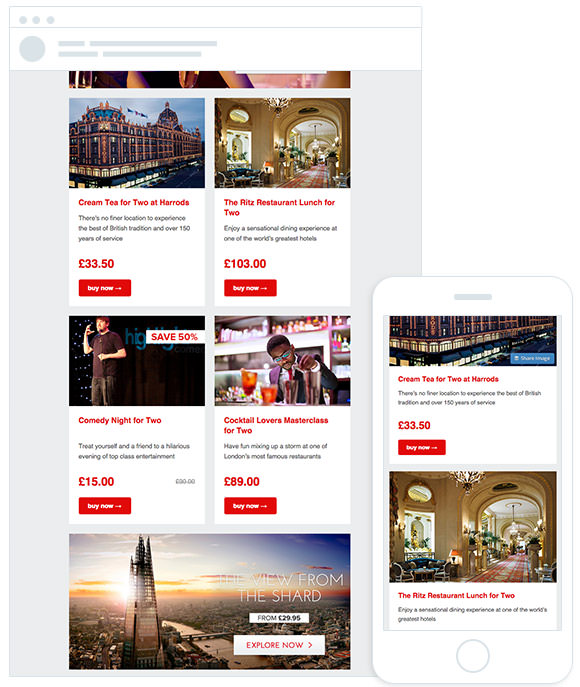
In order for you to get the best open and click-through rate, people need to be able to see your emails as they were intended no matter what device they are using, including mobile devices. The best way to achieve this is to use templates that were built for mobile.
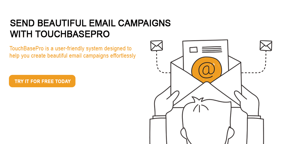
All TouchBasePro templates are built with mobile in mind. This means that you don’t have to do anything to the template for it to display perfectly on mobile devices, you build it once and it shows perfectly everywhere.
The other way to make your email template display perfectly on mobile devices is to make them responsive using code, which can require time and skills that many marketing teams simply don’t have. This is an approach that we only recommend if you have the skills and the time.
2. Use shorter subject lines
A mobile device’s screen is smaller than a desktop’s screen, as a result it is limited in the amount of content it can display all at once. This is especially true with the subject line. Your subject line is part of what people see first, so naturally they’ll use it to decide whether to open your email or not.
While desktop devices can display upwards of 80 characters, mobile devices usually display about 30 characters. So try keeping your subject line under 30 characters, you can do this using a tool such as Originality.ai’s Character Counter.
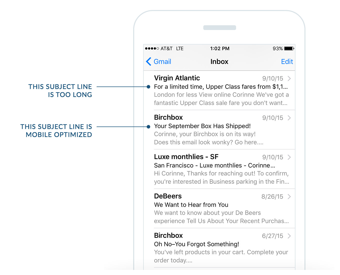
30 characters is really small. So you will need to be brief, but comprehensive.
3. Write a compelling pre-header text
The preheader is the short summary text that follows the subject line when an email is viewed in the inbox.
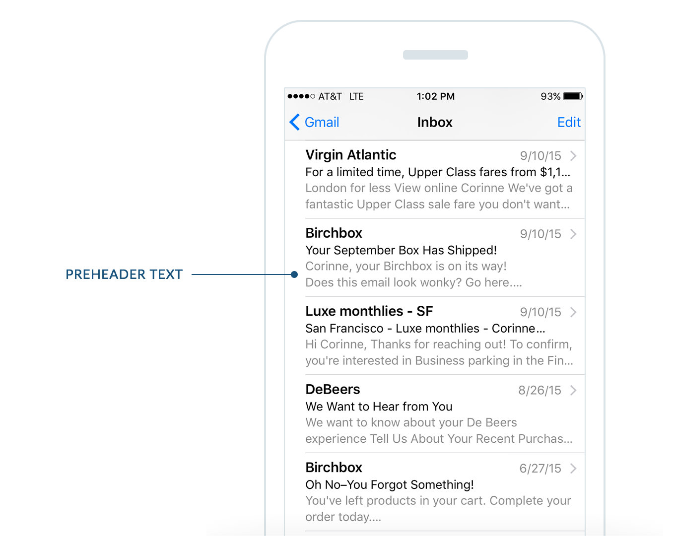
The preheader text is also one of the things people look at when deciding on whether to open your emails or not. So how can you optimize your preheader text for mobile devices?
The first thing to do is understand how much space you have, and this varies per email app. The table below can give you an indication of the differences per app.
| Device Name | Number of Characters Displayed |
| Android Native Email App | 40 |
| Android Gmail App | Varies based on lengths of subject line |
| Android Yahoo App | 45 |
| iOS Native Email App | 90 |
| iOS Gmail App | 50 |
| iOS Yahoo App | 50 |
| Windows Mobile | 40 |
*Results can vary based on your chosen copy as well individual user settings and preferences like font sizes and email clients. To get as close as possible to real-life results, we tested with the default email clients on each device, used Lorem Ipsum dummy text and had the device in portrait mode.
As you can see from the table above, keeping your preheader text at around 40-50 characters will make sure that it shows properly on most mobile devices.
Besides having the right amount of characters, it is also important to remember how the preheader text relates to the subject line. Popular marketing blogger Derek Halpern does a great job of this in his announcement campaign for his latest webinar.
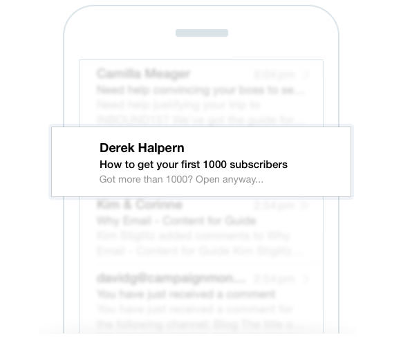
The subject line talks to a very specific audience (people who don’t yet have 1,000 subscribers) and while it makes the email appealing to those people, it limits appeal to others. He counters this by using the preheader text “Got more than 1000? Open anyway…” to address the other recipients who have more than 1000 subscribers already.
By using the subject line and preheader text together, Halpern makes the email appealing to a wider number of recipients and increases the chance they’ll open the email and click-through
4. Optimize the “From” Name
The “From” name is one of the most prominently displayed elements of your campaign when viewed on mobile devices.
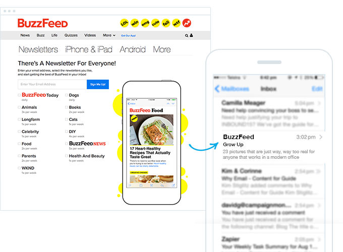
Pretend that you go to a site called Buzzfeed, you see a couple of articles that you like and now you want those articles to be delivered directly to your inbox. So, you subscribe to their newsletter.
At the end of the week your receive an email from someone called Darren and he’s sending you a bunch of articles that you “presumably” like. The first thing that’ll go through your mind is, who’s Darren? And why is he sending me emails? This doesn’t really encourage you to open the email. In fact, you might think that it’s spam and delete it.
The best approach to take is to use a “From” name that people are familiar with. This gives them an idea on who’s sending them an email, which increases the likelihood of them opening the email. In this Buzzfeed case, the best thing to do would have been to simply put Buzzfeed as the “From” name. This is because the user interacted with Buzzfeed and they know what to expect when they see an email from Buzzfeed in their inbox.
5. Make it easy for people to “touch” your content
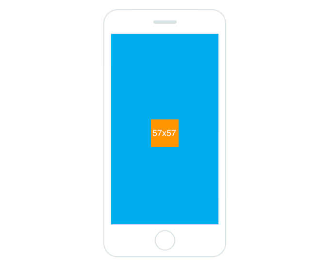
This one is relatively simple. People need to be able to click on things (Especially Call-To-Actions) they want to click on. This means that buttons need to be big enough so that people don’t click on other things by mistake.
As a recent MIT study shows, the average size of an adult index finger is between 1.6cm and 2 cm, which translates to between 45 x 45px and 57 x 57px on a mobile device.
Here’s a visual representation of that:
6. Have a mobile friendly website
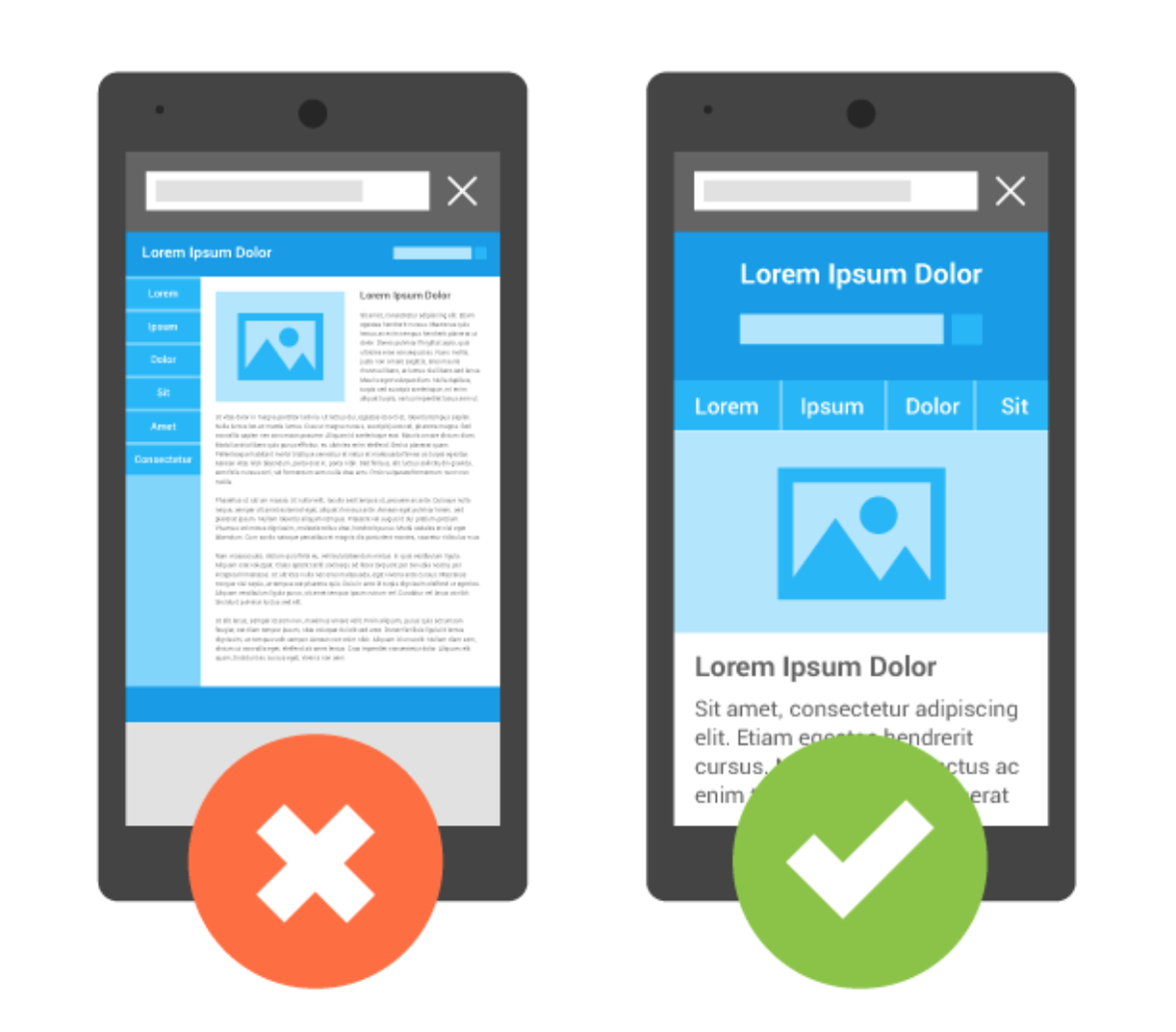
Even though designing email campaigns with TouchBasePro is awesome, often you will need to send people to your website. If your email campaign is going to meet your objectives, your site needs to be responsive (also known as mobile friendly). A mobile friendly site, as the image above suggest, is optimized for mobile devices. The content is properly laid out and one doesn’t have to zoom in to be able to read a piece of text or click on a Call-to-Action.
7. Track email client usage
Once you’ve taken all our tips into consideration and sent your emails, next is to actually track how they are performing. How many people have opened and clicked your campaigns and which devices did they open it on? Armed with this information, now you can optimize your campaign for the most popular devices and improve your open and click-through rate 🙂